Beautiful appearance will make your form even more attractive to be filled out. After completing your form's body design, you'll move to the "Appearance" step and make meticulous customization to texts, images and colors throughout the form. By doing so, you'll build a form that fulfills your aesthetic expectation.
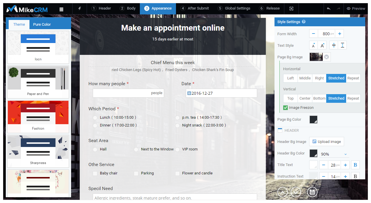
Similar to body design page, the entire "Appearance" page can be divided into three columns. The left column provides pre-designed form themes and color schemes, enabling you to update form's style in a second. The right column allows you to customize texts, images, and colors in each area of the form from top to bottom. Meanwhile, the center column presents the effect in real time after each setting. Now, let's have a closer look at the three columns.
Right column – style settings
The right column is the place for you to adjust the text and image styles related to the form appearance. From top to bottom, these style settings correspond to the structural arrangement of a form. At the top of the style settings, you'll find general settings for the entire form, such as page background and form width. Similar to body editing operations, the center column will usually show you the real-time effects after you make modifications to appearance settings.
General Settings
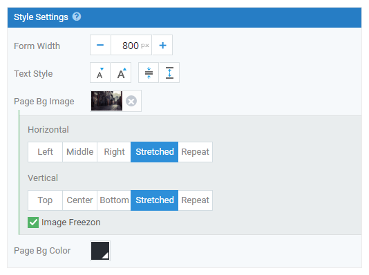
Form Width
By default, the form width is 800px. You may click the "minus" sign to decease width or the "plus" sign to increase width, 100px per click. You can also set form width by directly entering an integral number ranging from 200px to 3840px.
Form Font
Font settings here apply to all the text styles (excluding submit area text) in your form, which include the Form Title and Description in the header area, the Question, Description and Options in the body section. You may set the font size and the line height of these texts at one place.
Page Background Image
Page background image is applied to the entire form background, so the image must be large enough or be displayed repeatedly to fill the whole page. As you may have known, all the background images uploaded share the same mechanism for setting horizontal and vertical alignment.
Page Background Color
The page background of your form is filled with a color when you haven't uploaded any background image. As the basic element at the lowest layer, page background color doesn't support transparency setting since there is no element below to achieve a transparent effect.
Header Area
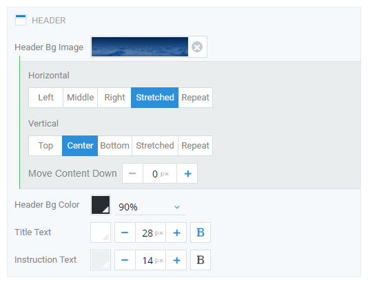
In the "Header" design step, you may have defined the alignment of header text, logo and background image, which are also available in the "Appearance" step. Besides, it's the place where you could configure header background color, and set the font color, font size and bold style of the form title & the description.
Changing color styles, such as the header background color, has the same operating process: click the color icon and then choose a color from the two-line predefined colors most in use. You may do further customization by clicking the lower right button to pick a color from the color palette or inputting a RGB color code directly. In addition to color design, you can also set transparency for the header background color to show the page background image/color behind it.
Body Area & Submit Area
Body Area
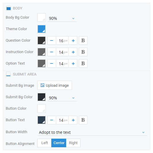
In this area, you are able to add the background color for the form's body, and customize the font size, font color and bold style for the text in all the widgets' Question, Instructions for User and Options. The process to change the body background color is the same as that to change the header background color, which supports color adjustment as well as transparency configuration.
Tips: the font size that you define for the options matches the font size of the text inputted by those who fill in your form through textbox-enabled widgets like the text widget.
Submit Area
Submit area is where we place the Submit button and located at the end of the body. You could set a separate background image and background color for the Submit area with the image alignment and the color transparency customized. What's more, you may also design the Submit button style by setting button color, button text style (font color, font size, and bold style), button width (autofit to text/match form width) and button position (right, center and left).
Tips: if you want to change the button text "Submit", you need to go back to the "Body" step, click the submit area, check the Customize the button and input the text for the button.
Left column- themes and pure color schemes
Pursuing an attractive form appearance but not having time to configure every style setting? You are recommended to use the themes and pure color schemes in the left side of the Appearance Design page, which are carefully designed by our expert designers. Taking advantage of these style solutions, you are able to elevate your form appearance to a pro level in no time.
Compared with pure color schemes, themes have delicate background images for the entire page, the header and the submit area. That's to say, pure color schemes don't have any image but only pure color background predefined. You may choose and apply the most appropriate one based on actual situation like the context and usage scenarios of your form. If you find an attractive template that meets your taste, remember to add it to your favorites for further use.
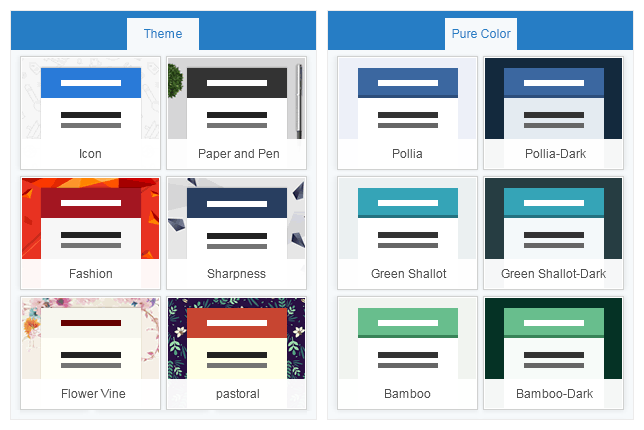
We'll continue to create and update form themes and color schemes. Meanwhile, exquisite and practical template collections will be continuously launched in our template center. Definitely, you are welcome to contribute your beautiful forms to our template center.
Form Design Workflow:
① Header ② Content ③ Appearance ④ After Submit ⑤ Global Settings ⑥ Release


